View image
Thoughts
"The trouble with having an open mind, of course, is that people will insist on coming along and trying to put things in it."
Terry Pratchet, Diggers
Using the HTML picture tag for swapping images
LinkedIn Twitter FacebookThe <picture> tag is probably the easiest way to have an image "respond" to the screen size - displaying an image in its original dimension, but swap to an alternate or smaller dimension when in mobile, etc. example ..
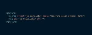
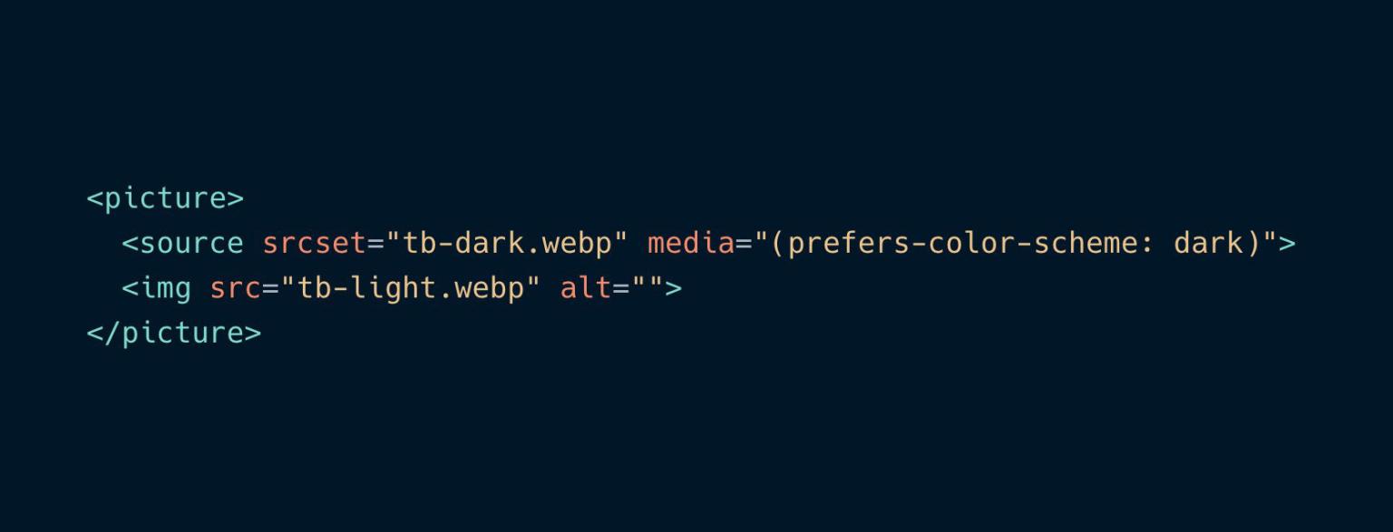
<picture>
<source srcset="img-640.jpg" media="(max-width:767px)">
<img src="img-1280.jpg" alt="" />
</picture>
But I just found out you can apparently use it to also swap images based on an OS's color scheme - dark vs light. I have personally not tried this trick yet, but this is a pretty cool tip!
PS. do take note of the <picture> browser compatibility before you use it for your client's websites - make sure their target or most visited audience uses a browser that supports the tag *coughs IE*.

Recent thoughts
Back to listing
Join us for here on the blog where we share our thoughts, ideas and conversations.
Implementing GraphQL in PHP
Our journey implementing GraphQL in PHP - the honeymoon ..
BlueSky Digital Labs & Horizon Digital join forces
We're pleased to announce that BlueSky Digital Labs and ..
BlueSky wins Business Person of the Year Award at the Belmont Business Awards 2022
It was a category we did not put our hands up for, but ..
Benefits of Automating in your business
As we know technology is improving every single day and ..
Curtin Capstone project presentation at BlueSky
Fast forward half a year, and the end-of-semester presentation ..
BASED at the Wrestling Australia 2022 National Championships
BlueSky sponsors BASED (Beat Aussie Streets Every Day) ..
BlueSky wins the Innovation Award at the Belmont Business Awards 2021
BlueSky won an award at the 28th Belmont & Western Australia ..